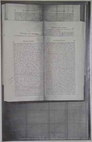
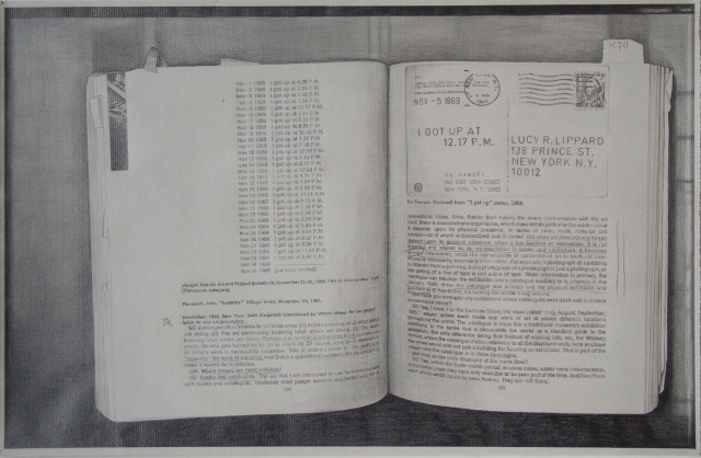
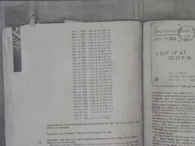
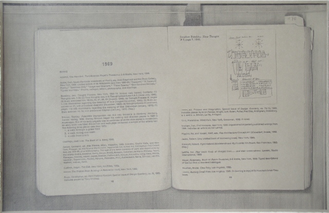
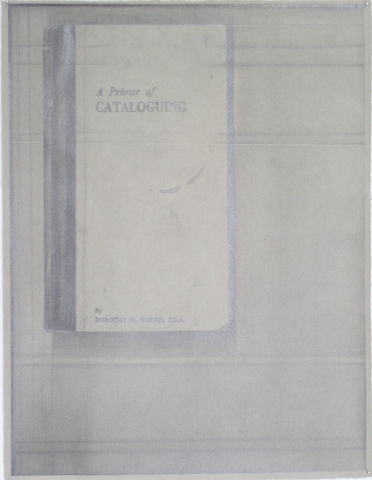
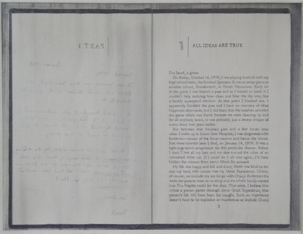
Drawings of Photocopies of Books (2005-2008)
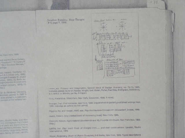
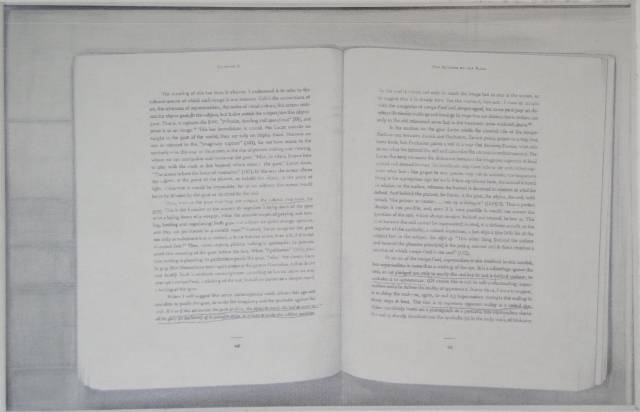
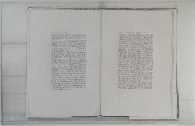
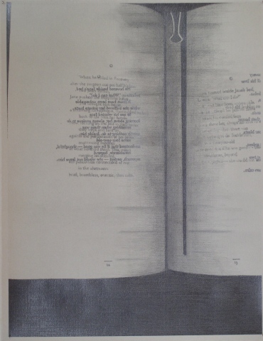
"These works gain their power from the way Springfield lavishes attention on the tiny though often legible typefaces. You can read them if you're so inclined. The selections are quite conscious [...]. Astute readers will note a spread from Elements of Style ("11. Don't explain too much"). The artist engages language as an aspect of conceptual art in the same way that, say, Eva Hesse did by making wall works that extended from the wall. In fact, one of Springfield's drawings, Hang Up (2005), includes an illustration of Hesse's similarly titled 1965-'66 piece. The younger artist's act is as much a gesture of hero worship as an act of self-conscious art referencing." - Glen Hefland
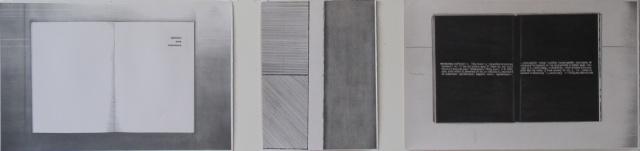
Graphite on paper
11 x 45 inches
2008